******************************************
hi, i’m Abbey.
i am a multi-disciplinary designer
based in Brooklyn NY.
******************************************
about me ︎︎︎
client work ︎︎︎
FUNHOUSE KNITWEAR ︎︎︎
personal work ︎︎︎
******************************************
email ︎︎︎
instagram ︎︎︎
FUNHOUSE KNITWEAR ︎︎︎
******************************************

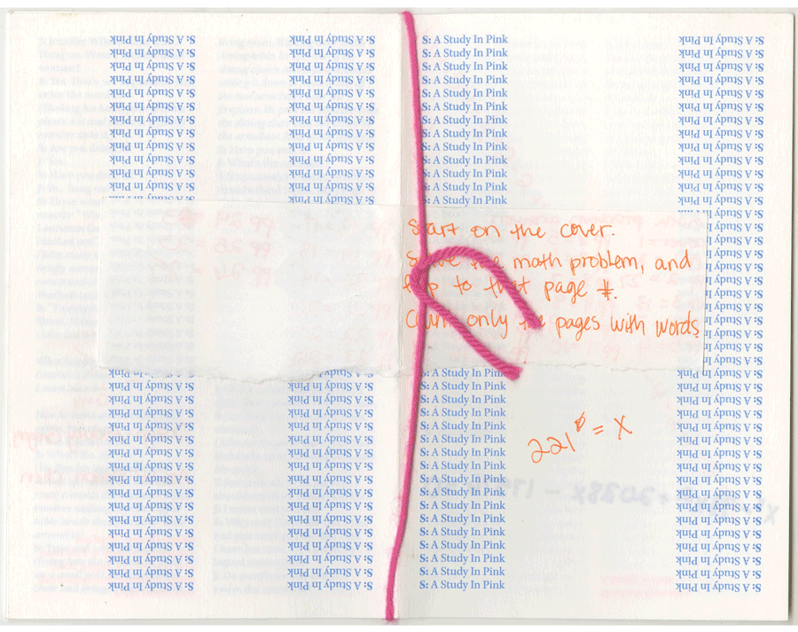
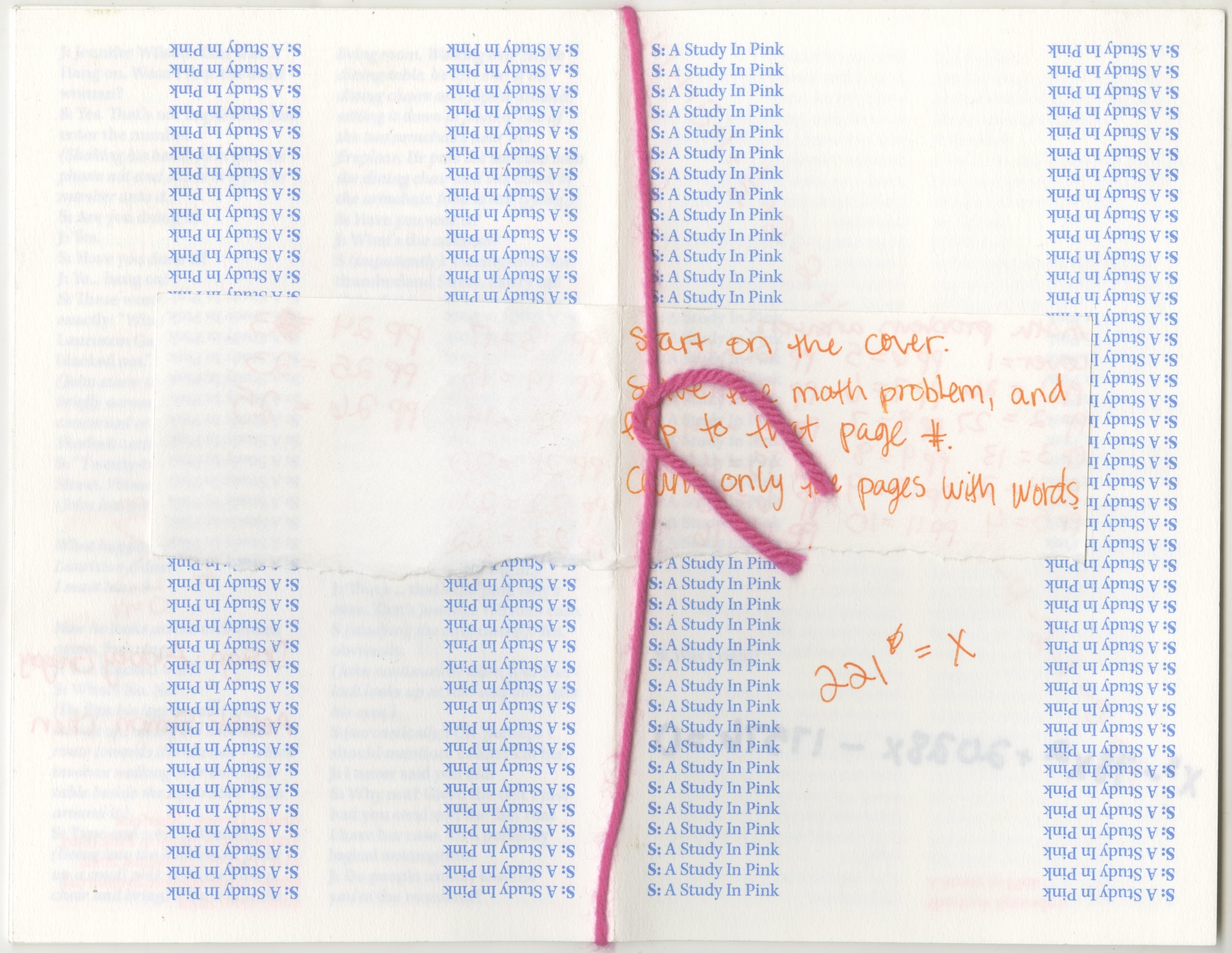
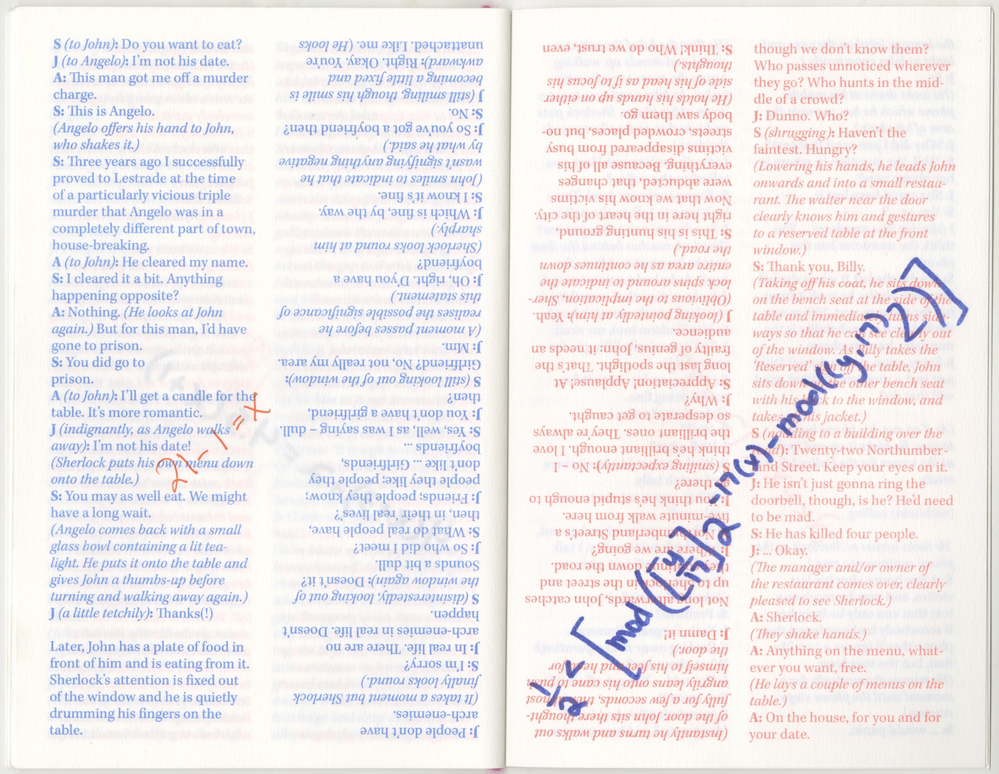
puzzle zine, 2021
this project is an exploration of intentionally niche design. i wanted to create a zine about my love of puzzles.
i chose to use the script from a single episode of Sherlock—a study in pink—in which the plot of the episode revolves around solving puzzles.
i typeset with the intention to have the paragraphs to alternate directions, and the pages to be printed out of order.
once printed, with the pages out of order, i then added a handwritten math problem on each page. when the problem is solved it indicates which page to turn to.
- risograph zine
- editorial design
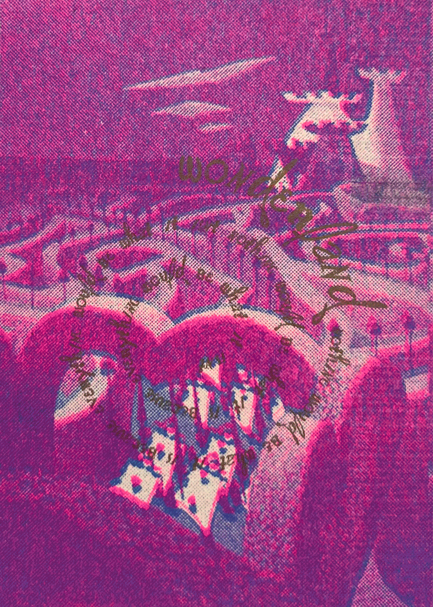
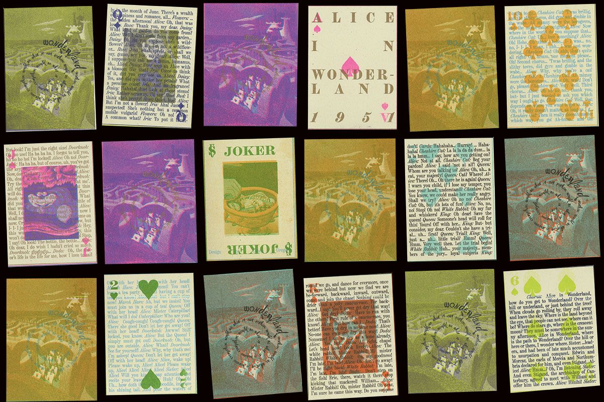
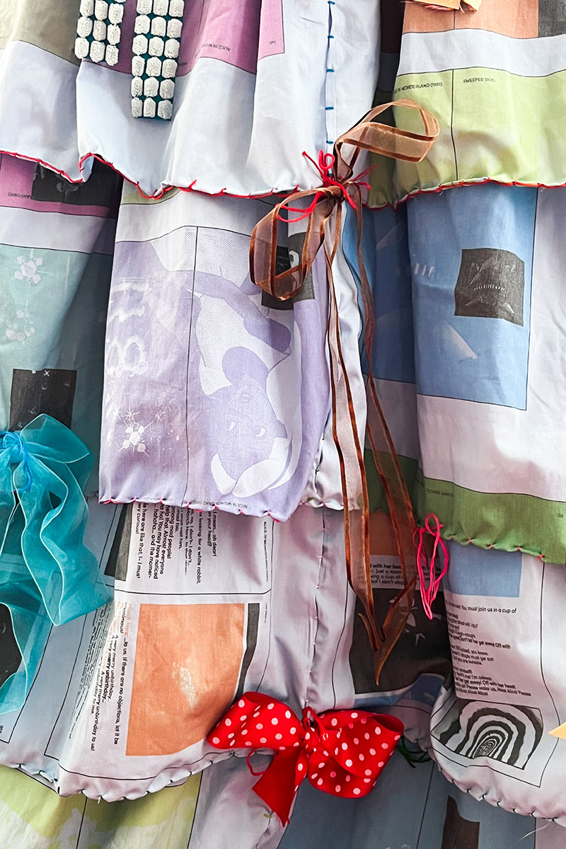
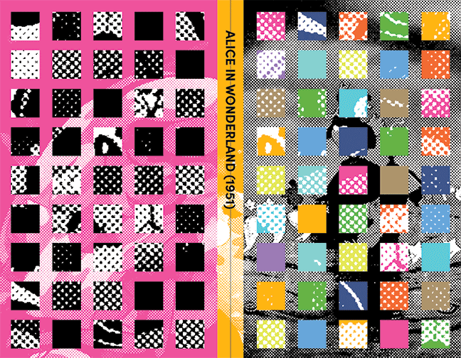
WONDERLAND, 2022
how does an avant-garde book form manipulate the way we interpret an otherwise recognizable storyline? WONDERLAND is an exploration of craft and book form through the lens of the 1951 Alice in Wonderland film adaptation.
the opulent psychedelia exhibited within the 1951 film adaptation of Alice In Wonderland has been a lifelong influence of mine, within my personal style and my design practice. the quote “nothing would be what it is, because everything would be what it isn’t” appears within the first minutes of the film, and serves as the crux of WONDERLAND. in saying so, Alice fantasizes about a world where everything is whimsical and wondrous.
in WONDERLAND, i employ Alice’s fantastical perspective to explore three avant-garde ‘book’ forms. the first exhibits the full script through the form of a risograph printed card deck. as the cards are shuffled, the narrative scrambles, and in turn offers an unlimited array of reading experiences. the second presents the film’s stills and script in the form of a gown. the flatplan of the book is printed onto the fabric of the dress with the pages scattered amongst the many skirts and pleats. the third highlights the title of the project which is then embedded onto the surface of tea cakes, and features an original typeface inspired by the hand-drawn letterforms within the film.
the exploration of the three books—playable, wearable, and edible—culminates in an installation where guests are immersed into the world of my own personal WONDERLAND.
- editorial design
- multi-color risograph prints
- dye sublimation printing
- hand-sewn gown
- installation design
- typeface design


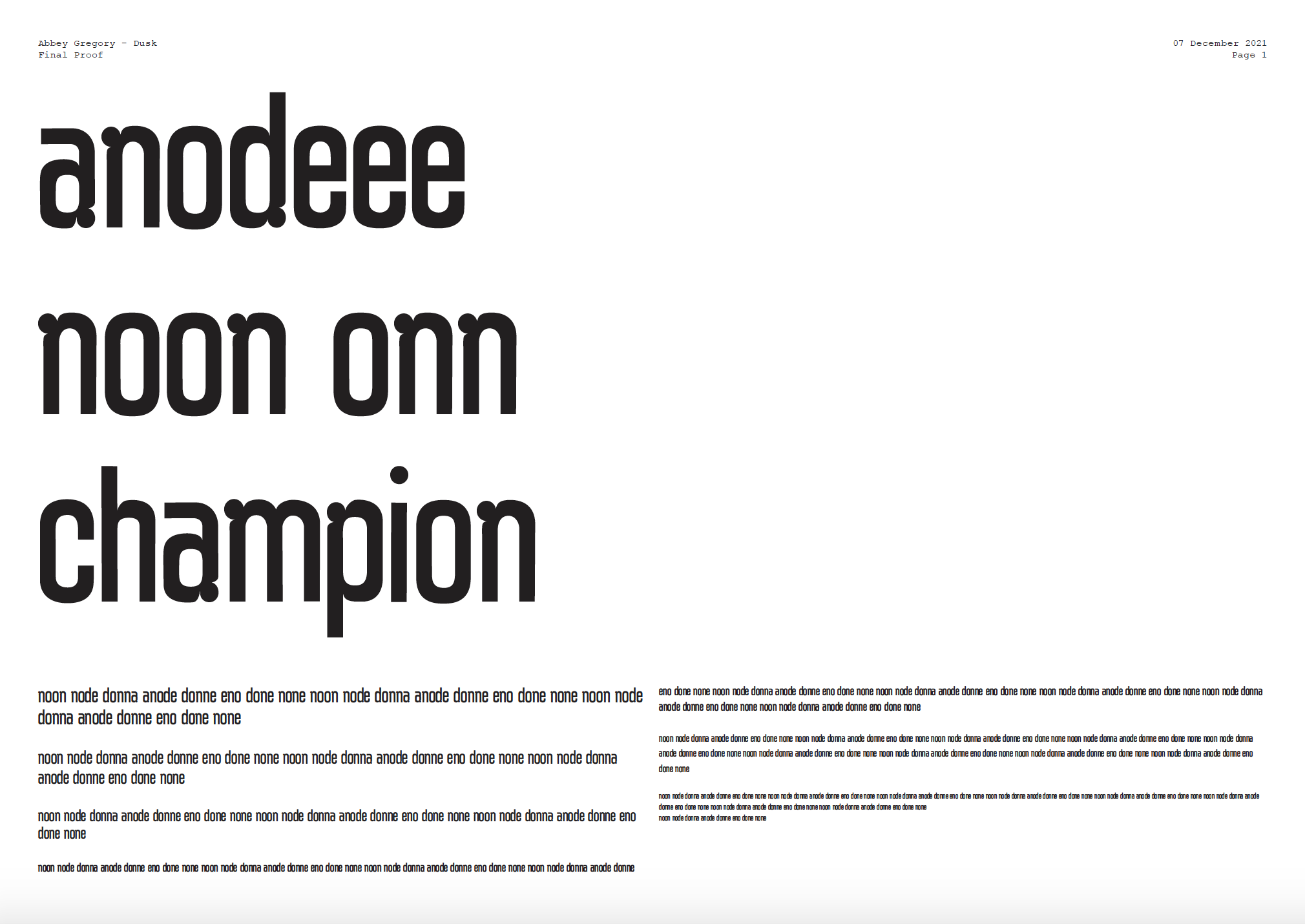
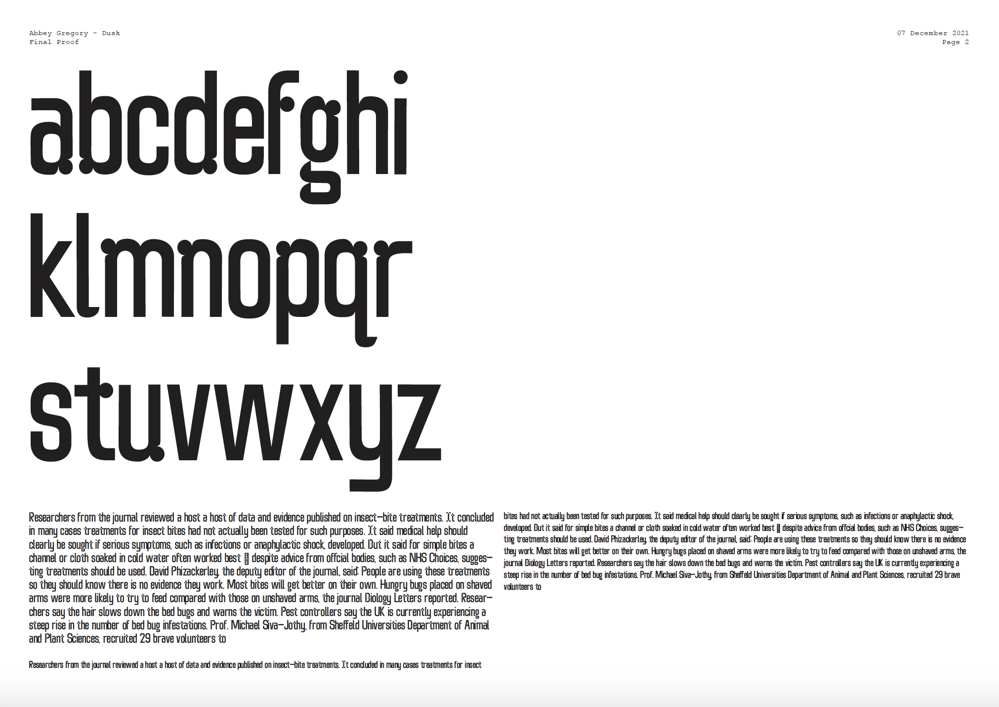
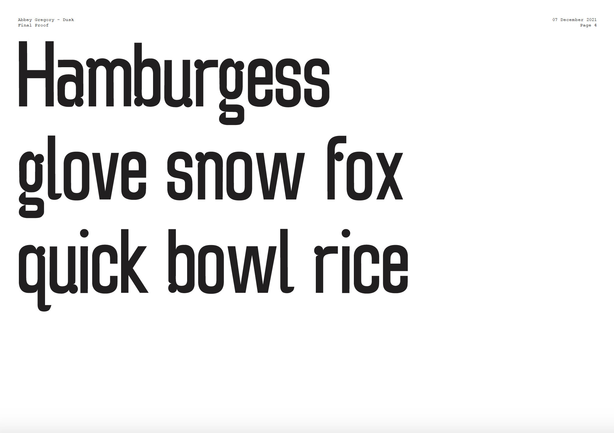
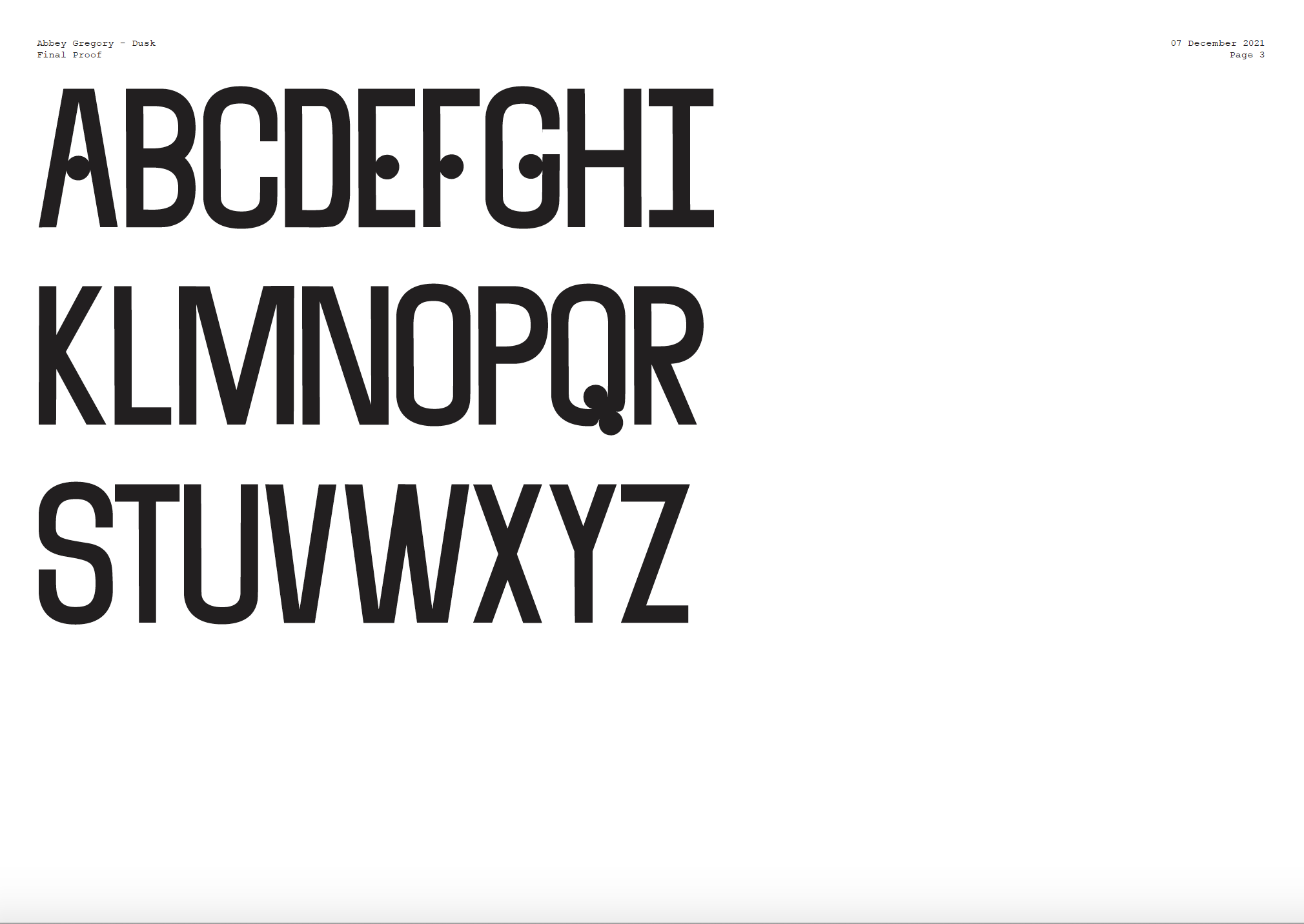
DUSK, 2021
handdrawn digital typeface
using Glyphs app. includes
lowercase, uppercase
and select characters.
- typeface design

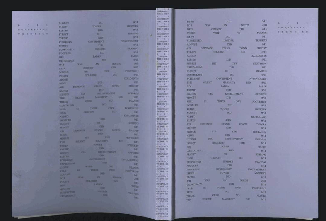
9.11 conspiracy theories, 2019
for this project, i took the contents of a wikipedia page, and typeset the contents into a full printed book.
the wikipedia page i chose was 9.11 conspiracy theories. i wanted the design of the book to fit the absurd—yet also serious—nature of the content.
the text blocks are designed as thin twin towers, and the blocks diminish with each consecuitve chapter.
the text is typeset in stark justification, to point toward the absurity. and the typeface—Century Schoolbook—is a classic 20th century serif, meant to bring attention back to the underlying seriousness of the topic.
- editorial design


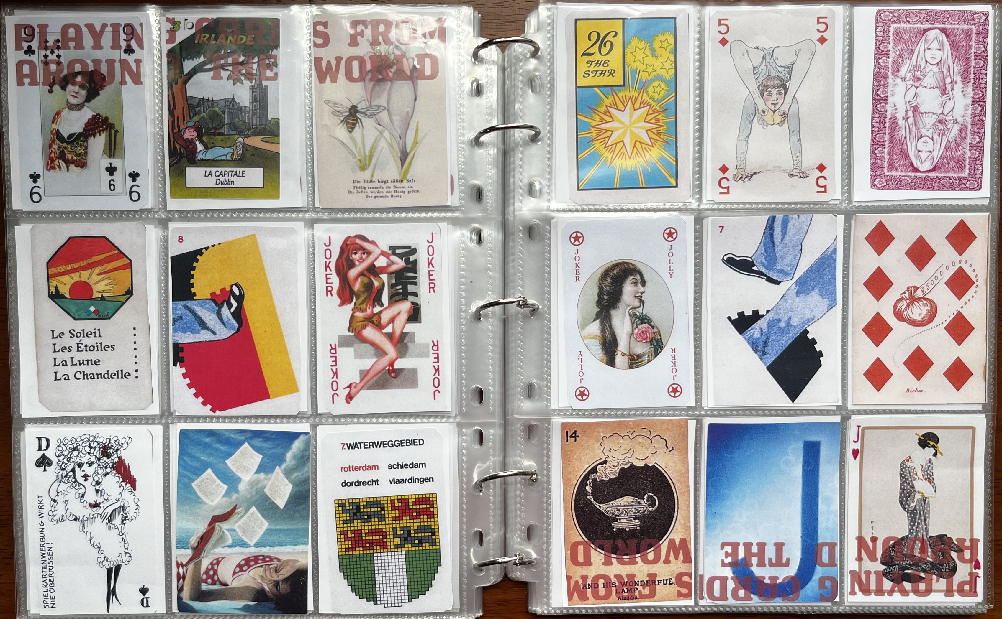
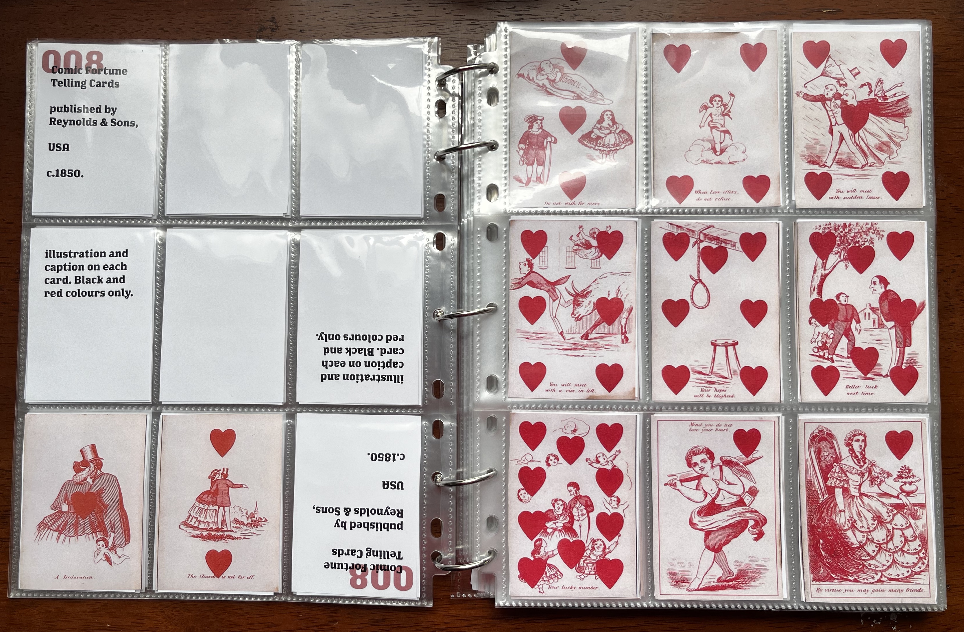
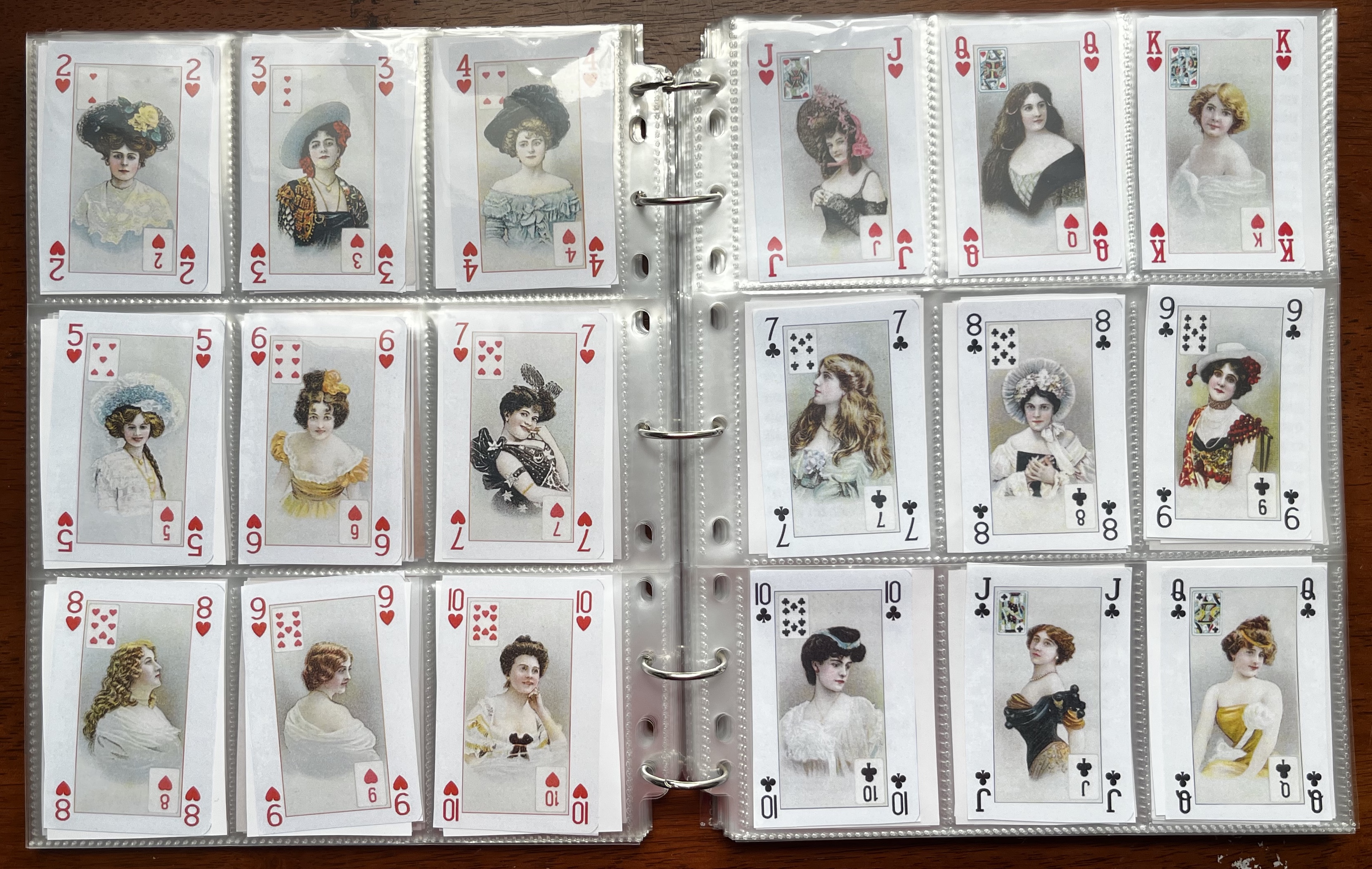
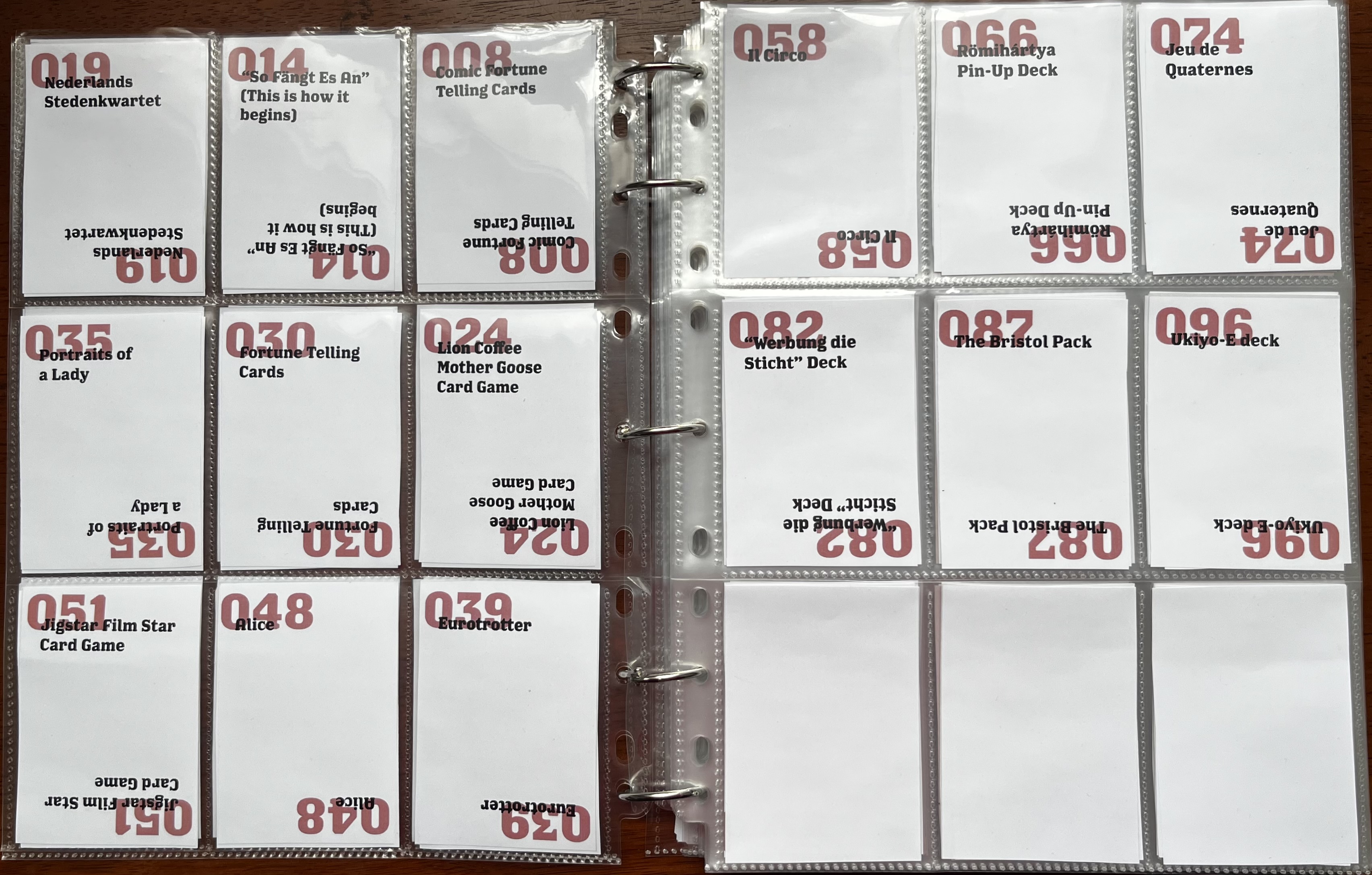
playing card archive, 2022
this passion project is an archive of playing cards from around the world. i wanted the design to match the visual language of a playing card.
the text is typeset with a slab serif—reminiscent of the classic bicycle playing card. the text is also repeated upright in the top left corner, and upside-down on the bottom left corner.
the spreads were then printed on 4inx3in paper and sloted into plastic trading card sleeves.
- editorial design